
I don’t deny that running can be an intensely aesthetic experience.
Some afternoons I’ll be out there on my own, running around Great Meadows at dusk as the last rays of sun make long shadows on the path, and I’ll reach some kind of tentative and temporary communion with my surroundings — the marshes and the river, the geese and the red-wing blackbirds, the scurrying creatures that scuttle away into the reeds along my path and the tiny insects that pepper my eyes and fly into my mouth. If I’m feeling old and achy and broken down, I might not be fully restored by the natural beauty of the scene, but I do find it easier to be content with what I have.
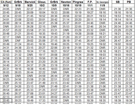
So I understand that my immortal soul owes much to the aesthetics of the sport, but if you really want to know my secret passion in running, it’s not aesthetic, it’s numeric. I just love data and, for me, communing with a spreadsheet full of names and times rivals the pleasure of circling Great Meadows at dusk.
My appetite for data peaks with the Fall Foliage and the cross country season.
You take a high school cross country team and have them race, and a million interesting things happen that you can’t possibly understand in one viewing. You get the results and start to look at them; you compare times to previous meets, previous years. You start to see trends, but not everything is clear. You need more data! So you go home and you pull out other results, and now you’re looking at results from other teams, and you form hypotheses.
Are we getting better? Is our training working? where will we be in eight weeks?
But that’s just the beginning. Soon you are asking yourself questions about the other teams and their runners, and you are trying to understand larger themes. Does a certain team tend to peak early? How many freshmen who run under 20 minutes for 5k in their first year, go on to run under 18 minutes by the end of their high school careers? What is the normal development curve for girls? For boys? How important is the spread from first runner to fifth runner, really? And of course, the classic and ultimately elusive question of how times compare on different courses.
Beyond understanding our collective state as a team, what do the data say about the individuals who comprise the team?
A race is a chaotic event, a mash-up of individual interactions, a network of intersecting stories. If you don’t look carefully, you might miss something astonishing — the mid-pack runner who suddenly figured out how to push through the discomfort and ran a 90-second PR. Think about what that means — a 90-second PR at 5K — and you might have missed it if you hadn’t spent hours with all the data.
I don’t consider myself hyper-numerical. I’m not a savant who remembers every time from every race from every runner, but I spend so much time sifting through results that lots of results become permanent memories, to be tapped season after season in the endless quest to understand what the heck is happening out there on the course. A certain athlete runs 23 minutes in his first race in high school, and goes on to be an All-New England runner by his senior year and a standout on his college team. I’ll invoke that runner’s name down the years as inspiration for this season’s skinny newcomers who have no idea what life has in store for them.
It’s supposed to be a beautiful day today for our first meet. Beautiful course. Beautiful weather.
And beautiful, beautiful data.
